Why Your Website Needs Form Popups for Instant Conversions
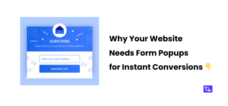
Want to know how to skyrocket your website conversions without a complete redesign? It’s easier than you think using form popups!
Form popups are the best solution to skyrocket conversion by instantly grabbing user attention. They’re appear on your screen and ask you to sign up for a newsletter, claim a discount, or get a free eBook.
If you’re wondering whether they actually work, let me tell you—they do! In fact, form popups can significantly increase your conversion rates if used properly.
In this post, I’ll break down why form popups are essential for any website looking to increase conversions and drive user action. In this post you will learn why form popups deserve a spot in your marketing strategy.
Let’s get started and learn how form popups can transform your website’s performance and increase subscribers, leads, or even paying customers.
What Are Form Popups and How Do They Work?
So, what exactly are form popups? They’re those small, sometimes unavoidable windows that pop up when you’re visiting a website. Usually these popups influences you to take action.
The action might be entering your email address for a newsletter or grabbing a limited-time discount.
How They Work
Form popups don’t just appear randomly. They’re typically triggered based on specific user behavior.
For example, some popups appear after a visitor has been on a page for a certain amount of time. Others pop up when someone scrolls halfway through an article. Then there are exit-intent popups that show up right when a user is about to leave a page.
There are all kinds of popup forms you can use. For example a simple newsletter sign-up, a flashy lead magnet offering a free guide, or even a time-sensitive discount. It’s all about understanding your audience and what will make them act.
Why They’re Effective
Now, you might be wondering why these popups actually work. There’s some psychology behind it.
A well-timed form popup can catch user’s attention based on specific scenarios. It creates a sense of urgency or a fear of missing out (FOMO). This then influences them toward taking action.
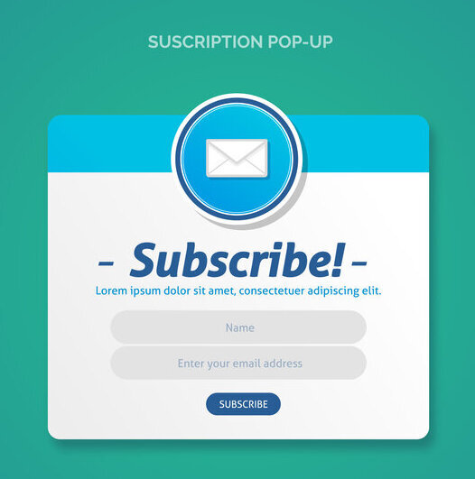
The Role of Form Popups in Conversions
Before we dive deep, let’s clarify what we mean by “conversions.”
A conversion happens when a website visitor completes a desired action. It can be signing up for your newsletter, registering for a webinar, or making a purchase. It’s the goal you want your users to reach.
Form popups can be incredibly effective in driving these conversions. Because they create opportunities for users to take those type actions.
They are also designed to turn casual visitors into engaged users.
According to some studies, form popups can increase conversions by up to 40%! That’s a massive boost for any kind of website.
Popups can quickly grab a user’s attention and drive them to take action before they leave your site. If you’re in eCommerce you can create popups offering limited-time discounts. This can push visitors toward making a purchase.
An engaging form popup can also capture valuable emails for your marketing campaigns if your focus is on lead generation.
Types of Conversions Form Popups Can Drive
Form popups aren’t limited to just email sign-ups. They can drive multiple types of conversions, such as:
- Email subscriptions
- Lead generation for sales teams
- Webinar registrations
- Downloads of free resources like eBooks or whitepapers
A well-designed form popup can make all the difference in increasing your website’s conversion rates.
The Key Benefits of Using Form Popups
A. Immediate User Engagement
You only have a few seconds to grab attention when someone lands on your website. This is where form popups can be useful.
They create an immediate touchpoint that encourages users to take action right away. This can be signing up for your newsletter or checking out your latest offer.
Popups can also help reduce bounce rates. Because they keep visitors on your site longer. Also, they direct them to valuable content or offer a discount they didn’t expect.
B. Increased Lead Generation
One of the main benefits of using form popups is how effective they are at capturing emails and growing your list.
You can start nurturing leads once you’ve got those email addresses. You can also push them further down the sales funnel.
This can be done by offering lead magnets. You can offer free eBooks, guides, or discount codes.
C. Boost Sales with Timely Offers
Who doesn’t love a good deal? Timely popups offering discounts or flash sales can influence users to make a purchase.
Exit-intent popups are great for this. For instance, right before a visitor leaves, you can offer them a 10% discount, and boom! They’re back to your checkout page!
Types of form popups to use in this case:
- Countdown timers to create urgency
- Flash sale popups for FOMO.
- Exit-intent popups to save abandoned carts
D. Improved User Experience
Nobody likes being bombarded by popups. But when they’re done right, they can actually enhance the user experience.
The trick is to use them strategically and set the right trigger points. This will also make the popups feel organic rather than intrusive.
For instance, when a visitor is reading an article on your blog, don’t throw a popup in their face the second they land on the page.
Instead, wait until they’ve scrolled halfway through or spent a certain amount of time. The popup feels more like a helpful suggestion than a disruptive ad this way.
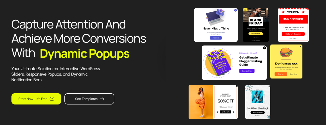
Have a WordPress website and want to create form popups for free? Click the button below for the step-by-step process for creating free form popups within minutes!
Best Practices for Using Form Popups Effectively
A. Timing and Triggers
Timing is everything with form popups. Too soon, and you risk annoying your visitors. Too late, and they may already be gone. The sweet spot for triggering a popup is typically after a user has spent 30 seconds on a page or scrolled halfway down.
Popular triggers include:
- Time delay (e.g., 30 seconds after landing on the page)
- Scroll percentage (e.g., after scrolling 50%)
- Exit intent (when the user is about to leave the site)
B. Creating a Clear and Enticing CTA (Call-to-Action)
The heart of any successful form popup is a clear and enticing call-to-action (CTA). This is the part that motivates users to take the desired action, whether that’s downloading a free guide or subscribing to your newsletter.
To make your CTA effective, be specific and actionable. Compare these two CTAs:
- “Sign Up” vs. “Get Your Free eBook Now” Which one are you more likely to click on? Exactly!
C. Design and Placement
The design of your popup is just as important as its timing. You want your popups to be eye-catching but not intrusive. Stick to clean designs that align with your brand, and make sure your popup is responsive (works well on both desktop and mobile).
As for placement, consider where your popup appears on the page. Should it be front and center, or would a more subtle bottom-corner popup work better?
D. Personalization Matters
Personalized popups are gold. By using dynamic content that adapts based on the user’s behavior, location, or previous interactions, you can make your popups more relevant and effective.
For example, if someone from New York is browsing your site, your popup could say, “Hey, New Yorker! Grab 10% off your first purchase.” Personalization like this makes users feel more connected and more likely to engage.
Common Mistakes to Avoid with Form Popups
A. Overusing Popups
Too many popups can easily frustrate your visitors, leading to high bounce rates and lost sales. A common mistake is bombarding users with popups every few seconds. To avoid this, strike a balance between engaging and overwhelming.
B. Poor Mobile Optimization
Mobile traffic is huge these days, and if your popups aren’t optimized for mobile devices, you’re missing out on a large portion of your audience. Make sure your form popups are mobile-friendly with responsive designs that adjust to different screen sizes.
C. Irrelevant Offers
Another mistake I see often is irrelevant popups that don’t align with the user’s journey. If someone is reading a blog post about SEO, they probably don’t want to see a popup offering a discount on your eCommerce products. Tailor your popups to fit the context of the page and the user’s interests.
Now that we’ve covered the essentials of form popups and how they can benefit your site, it’s time to take a deeper look at specific strategies to make your popups more effective.
Advanced Strategies for Maximizing the Impact of Form Popups
A. A/B Testing Your Popups
One of the best ways to ensure that your form popups are as effective as possible is by conducting A/B tests. This allows you to compare two different versions of the same popup to see which one performs better.
You can A/B test several elements of a popup, such as:
- Headlines: Test variations of your headline to see which grabs the most attention.
- Call-to-Action (CTA): Experiment with different CTA phrases like “Sign Up Now” vs. “Get Your Free Guide.”
- Design: Try out different color schemes, fonts, or images to see what resonates with your audience.
- Timing: Test whether users respond better to popups that appear after 10 seconds versus 30 seconds.
The key here is to be patient and run your tests long enough to gather meaningful data. A single A/B test can reveal critical insights that help you tweak your popups for maximum impact.
B. Segmenting Your Audience for Targeted Popups
Not all users are the same, so why show everyone the same popup form? With audience segmentation, you can tailor your popups based on user behavior, demographics, or interests. This allows you to create more personalized experiences, leading to higher conversion rates.
Here are a few ways you can segment your audience:
- Returning vs. New Visitors: Show different popups to people who are visiting for the first time versus those who have been on your site before.
- Referral Source: If someone comes to your site from a social media campaign, you could show them a specific popup related to that campaign.
- Page-Based Popups: Create popups that are specific to the content on a particular page. For example, a blog post about eCommerce might trigger a popup offering an eBook on boosting sales.
You can create a more relevant and engaging experience, increasing the chances of conversion by targeting specific user segments.
C. Exit-Intent Popups for Capturing Abandoned Visitors
Exit-intent technology tracks when users are about to leave your site and triggers a form popup just before they go. These popups have proven to be extremely effective at reducing bounce rates and capturing those almost-lost conversions.
The key to exit-intent popups is offering something valuable at the last moment:
- Special Discount: “Wait! Here’s 10% off if you complete your purchase.”
- Free Resource: “Leaving so soon? Grab this free guide before you go.”
- Newsletter Sign-Up: “Don’t miss out! Subscribe to our newsletter for the latest updates.”
Exit-intent popups are like a last-ditch effort to keep users engaged with your site. They work really well for eCommerce sites trying to recover abandoned carts or blog sites looking to capture email leads.
How to Measure the Success of Your Form Popups
A. Key Metrics to Track
It’s important to track their performance to see how effective they are. Measuring the right metrics can help you optimize your form popups and ensure they’re contributing to your conversion goals.
Here are the key metrics you should be paying attention to:
- Conversion Rate: The percentage of visitors who complete the desired action (like signing up for a newsletter) after interacting with your popup. A high conversion rate means your popup is doing its job.
- Bounce Rate: If your popups are causing users to leave your site, that’s a problem. Monitor bounce rates to ensure your popups aren’t too intrusive.
- Click-Through Rate (CTR): The percentage of users who click on the popup’s CTA. A low CTR might indicate that your messaging or design needs improvement.
- Time on Site: Measure whether visitors spend more time on your site after interacting with a popup. Longer time on site suggests higher engagement.
B. Tools to Use for Measuring Success
To effectively measure and analyze the performance of your form popups, you’ll need the right tools. Some popular options include:
- Google Analytics: Track user behavior on your site and see how popups influence conversions.
- Popup-Specific Tools: Tools like OptinMonster, Sumo, or Privy allow you to create popups and provide detailed analytics on how well they’re performing.
- A/B Testing Platforms: Platforms like VWO or Google Optimize can help you run A/B tests and analyze the results to improve your popup performance.
With the right tracking and analytics in place, you’ll be able to continuously improve your form popups for even better results.
C. Gathering User Feedback
Sometimes the best way to know if your popups are working is to ask your users directly. Gathering feedback through surveys or post-popup engagement can provide valuable insights that you won’t find in metrics alone.
You could ask questions like:
- “Was this popup helpful?”
- “What could we do to make this offer more valuable to you?”
Use this feedback to tweak your popups for a better user experience and higher conversion rates.
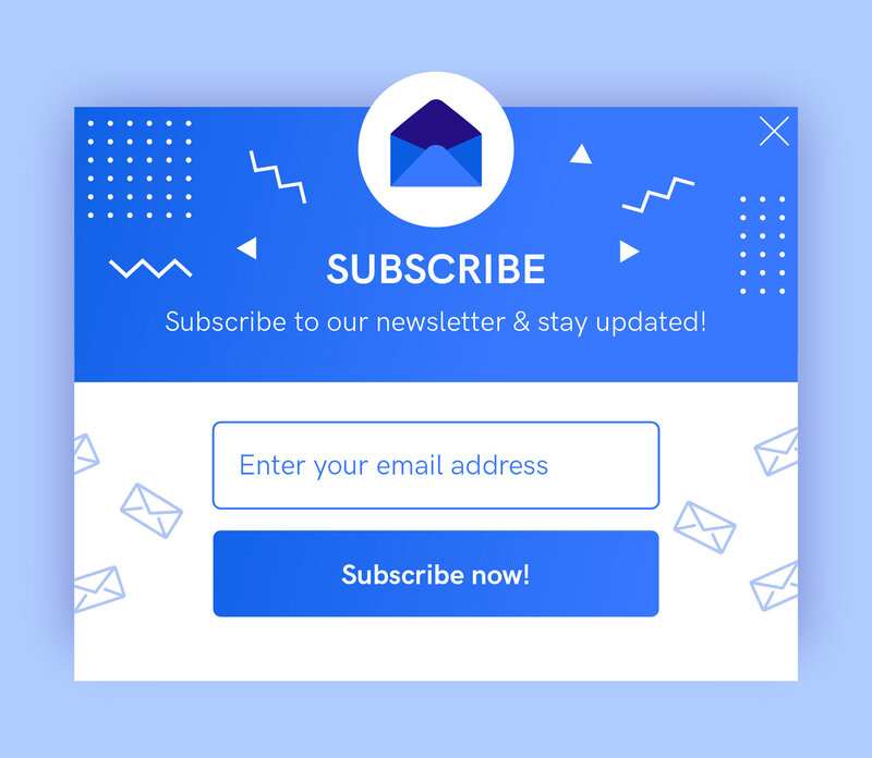
Examples of Highly Effective Form Popups
A. eCommerce Discount Popups
One great example of a form popup in action is an eCommerce discount offer. Imagine a user who’s been browsing your online store for a while but hasn’t added anything to their cart. A well-timed popup offering 10% off their first purchase could be the push they need to complete a transaction.
Why It Works:
- Immediate value: The discount is enticing and offers instant gratification.
- Exit intent: If the user is about to leave, it serves as a last-ditch effort to retain them.
- Clear CTA: A button like “Claim My Discount” drives the user to take action.
B. Content Upgrade Popups on Blogs
If you run a blog or content-heavy site, content upgrade popups can be incredibly effective. These popups offer an additional resource, such as a checklist or eBook, in exchange for an email subscription.
Why It Works:
- Value proposition: Users get something extra that adds value to the content they’re already consuming.
- Targeted timing: Popups can appear after a user has scrolled through a significant portion of a post, signaling interest.
- Lead generation: You collect emails, allowing for future engagement via newsletters or follow-ups.
C. Webinar Registration Popups
Let’s say you’re hosting a webinar and want to drive registrations. A form popup that promotes your event can be an effective tool, especially if it offers a quick and easy sign-up process.
Why It Works:
- Urgency: Adding a countdown timer creates a sense of urgency, encouraging users to act fast.
- Personalization: Popups can address users based on their previous interactions, such as “Join us for this exclusive webinar just for our blog readers.”
- Clear benefit: The popup clearly outlines what users will gain from attending the webinar.
Conclusion
Form popups might seem like a small addition to your website but their impact on conversions is undeniable.
A well-crafted form popup can be the secret weapon that takes your site’s performance to the next level.
Remember, it’s all about being strategic with your timing, messaging, and design.
Do A/B testing, targeted audience segmentation, and add a clear call-to-action. These things can ensure your form popups become a powerful conversion tool.
Now, it’s time to experiment, optimize, and watch your conversion rates go high!
What are you waiting for? If you haven’t started using form popups yet, now is the perfect time.
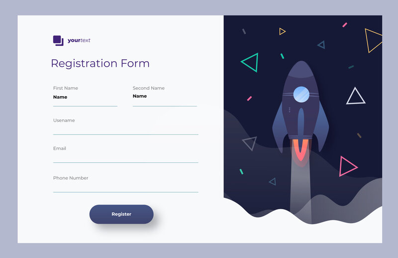
If you are a WordPress user then WPB Form Popup is the best free plugin out there to create eye-catching form popups.
Give this WordPress form popup plugin a try and see how it can boost your conversions. Don’t forget to A/B test and optimize for the best results!
FAQ for “Why Your Website Needs Form Popups for Instant Conversions”
Absolutely! Many form popup tools, like OptinMonster and Sumo, offer responsive designs that work seamlessly on mobile devices.
It’s best to show popups strategically, like after a user has spent some time on your page or when they’re about to leave (exit-intent). Avoid bombarding them with multiple popups in a short period.
WPB Form Popup and WPB Form Popup Pro is the best form popup plugin out there.
Yes, by using triggers like scroll percentage or exit-intent, you can ensure that your popups are helpful rather than intrusive.
Here’s a step by step guide to set up a form popup in WordPress.

